Typography
Corporate typeface
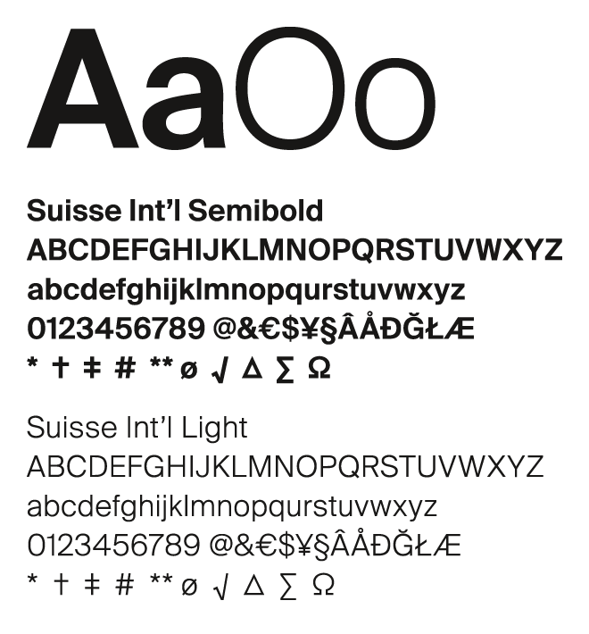
Corporate typeface: Suisse Int’l
Suisse Int’l is a solid and neutral font to underline the scientific approach of AO.
Its classic shape is an homage to Swiss typography culture and stands in sharp contrast to the organic logo. Clear and plain, it is designed for all of today’s digital and print needs.

Typography
Corporate typeface
Suisse Int’l Semibold
for headline
Spacing: -10
Line spacing: 95 percent
for accentuations in body copy
Spacing: +5
Line spacing: 100 percent
Suisse Int’l Light
for body copy
Spacing: +20
Line spacing: 120 percent
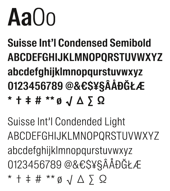
Alternative: Arial
Arial is the alternative typeface when Suisse Int’l is not installed (like PowerPoint presentations and other Microsoft Office applications).
Spacing: -10
Line spacing: 110 percent
Request your font license
here
Please note:
To get the whole range of the
Greek characters, please
use either Helvetica or Arial
as replacement for Suisse Int’l
Corporate typeface
Additional typeface for tables (eg, event programs)
Office typeface
Typography
Additional typefaces
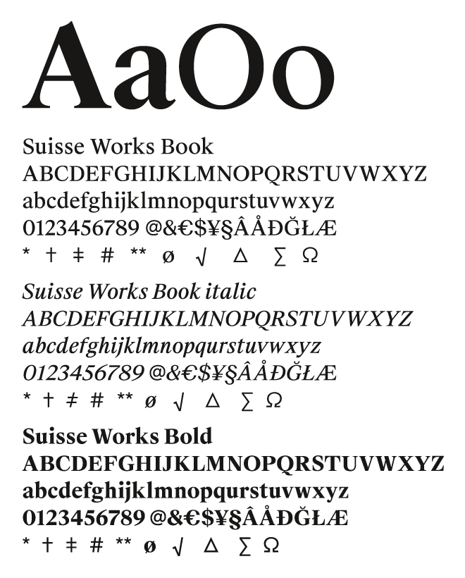
Suisse Works
Additional typeface for body text when readability has absolute priority (like reports, studies and long texts)
Spacing: +10
Line spacing: 120 percent.
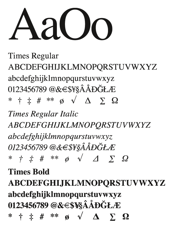
Alternative: Times
Times is the alternative typeface when Suisse Works is not installed (like PowerPoint presentations and other Microsoft Office applications).
Spacing: 0
Line spacing: 120 percent
Request your font license
here
Please note:
To get the whole range of the
Greek characters, please
use either Helvetica or Arial
as replacement for Suisse Int’l
Additional typeface
Office typeface
Typography
Additional typefaces
Non-Latin typefaces
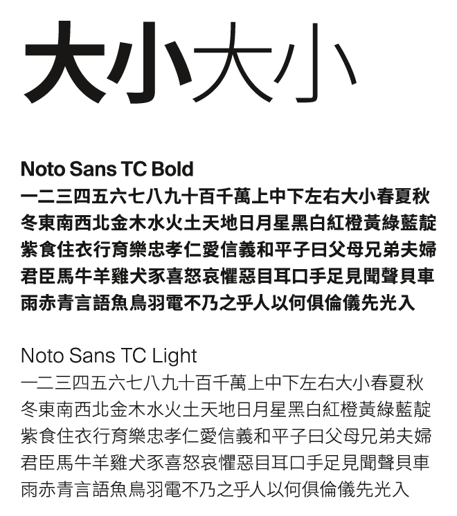
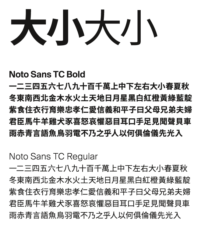
Noto Sans TC
Mandarin is laid out in the Google font Noto Sans TC for use in both regular and office applications.
Request your font license
here
Main typeface family
Office typeface
Typography
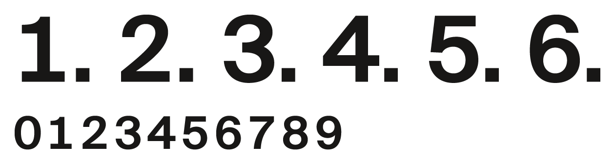
Alternative numbers
Rules for tables and lists
The guiding principle here is optimizing readability and ensuring content is as appealing as possible.
Use Suisse Int’l alternative numbers whenever there are a large amount of numbers, for example, in the following cases:
– tables
– table of contents
– enumerations
– page numbers
– scientific formulas
How to get alternative numbers
Go to window “characters” → choose the menu on the right and go to “open type” → select “versal digits for tables”
Corporate typeface
Application
Typography
Typographic principles
Clear and bold
In order to make the self-confidence and liveliness of the brand tangible, the AO corporate typefaces are used to create interesting contrasts.
This applies, for example, to the size of the headline in relation to the copy text or the positioning of the font in the layout. In addition, contrasts are created by always setting the headline in semibold and the copy text in regular.
In most cases, the typography is left-justified; only in exceptional situations is it right-justified. It is never centered.
When information is set on AO blue, accents can be created by using yellow sparingly. It is important to make sure that this is done at the beginning of the headline.
In headlines or tables, the numbers are shown in tabular format.