
Books
Cover principles
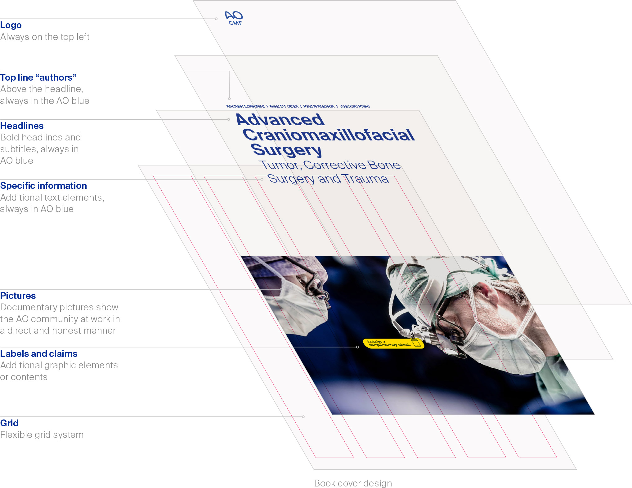
Uniform appearance
The key to our corporate design is the correct combination of graphic elements to create a consistent yet flexible design system.
The basic structure is clear and easy: Position the logo on the top left, set semi-bold headlines, place pictures in the grid and add other content carefully.
Accurate, deliberate design plays with the white space and creates clear and convincing communication. The layout principle is simple; apply it consistently.
For ready-made templates including grid and other specifications, please contact:
communications@aofoundation.org
Books
Cover principles
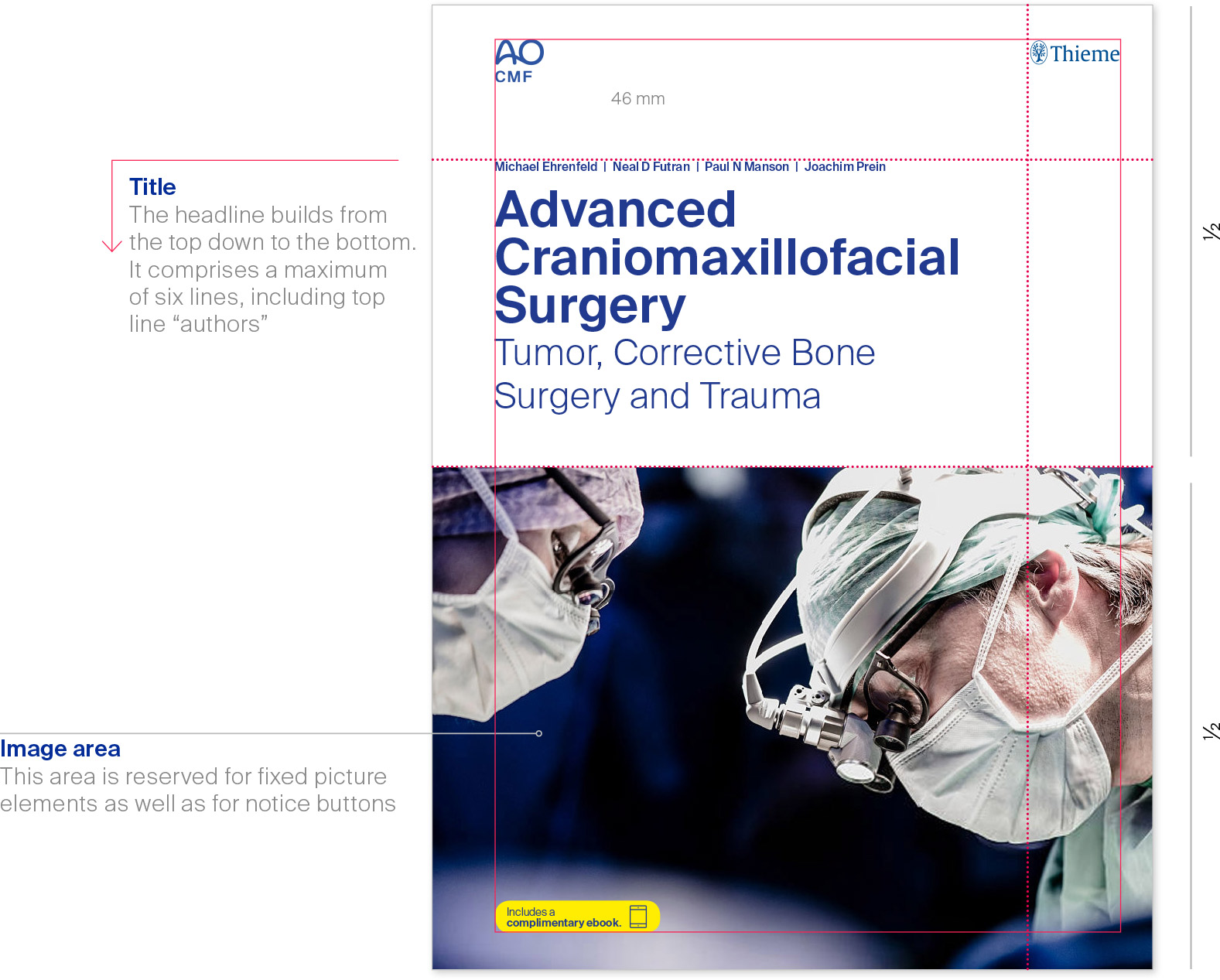
To the point
The clear grid creates a tidy and professional overall appearance.
The layout should ensure the topic is quickly accessed, with image and text coordinated harmoniously. The layout comes to life through a clear headline and carefully chosen image.
For ready-made templates including grid and other specifications, please contact:
communications@aofoundation.org
Example AO CMF book cover
Books
Cover examples
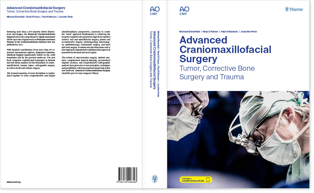
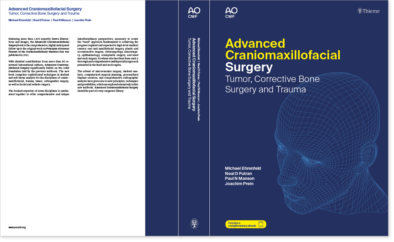
Educating for excellence
AO book design offers you the option of using Suisse Works serif typeface in combination with the primary corporate typeface Suisse Int’l.
This helps achieve an effortless but unmistakably scientific and literary feel.
The layout of the cover is clean and user-oriented and adapts easily and intuitively to different types of content.
Standard version with picture: front, back, and spine
Alternative version with illustration
Books
Books Text pages, grid A4
Flexible
A simple, six-column grid serves as an invisible structure for all text page designs.
The grid can be applied in a variety of ways, responding to text type, overall length and pictures. Successful layout exploits the tension between bold headlines and calmly presented body text.
six-column standard grid
Variations

Books
Text pages, examples
Educating for excellence
The flexible, six-column grid organizes the page composition and allows various layout options for all needs.
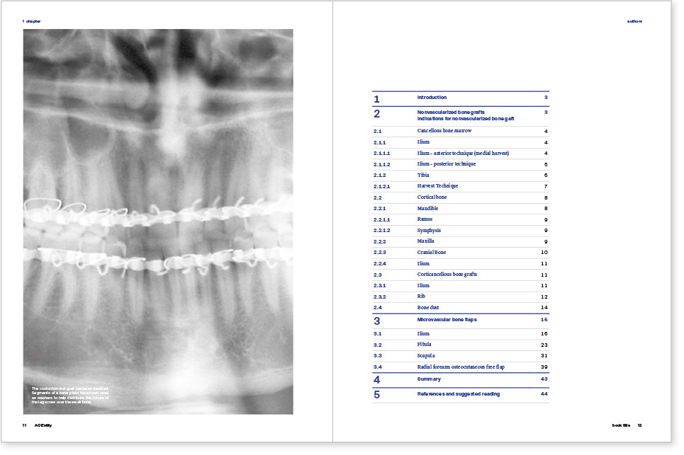
Opener page, table of contents page
Content page with images and illustrations
Chapter introduction page and following pages
List of References / Bibliography
Books
Text pages, details
It’s in the details
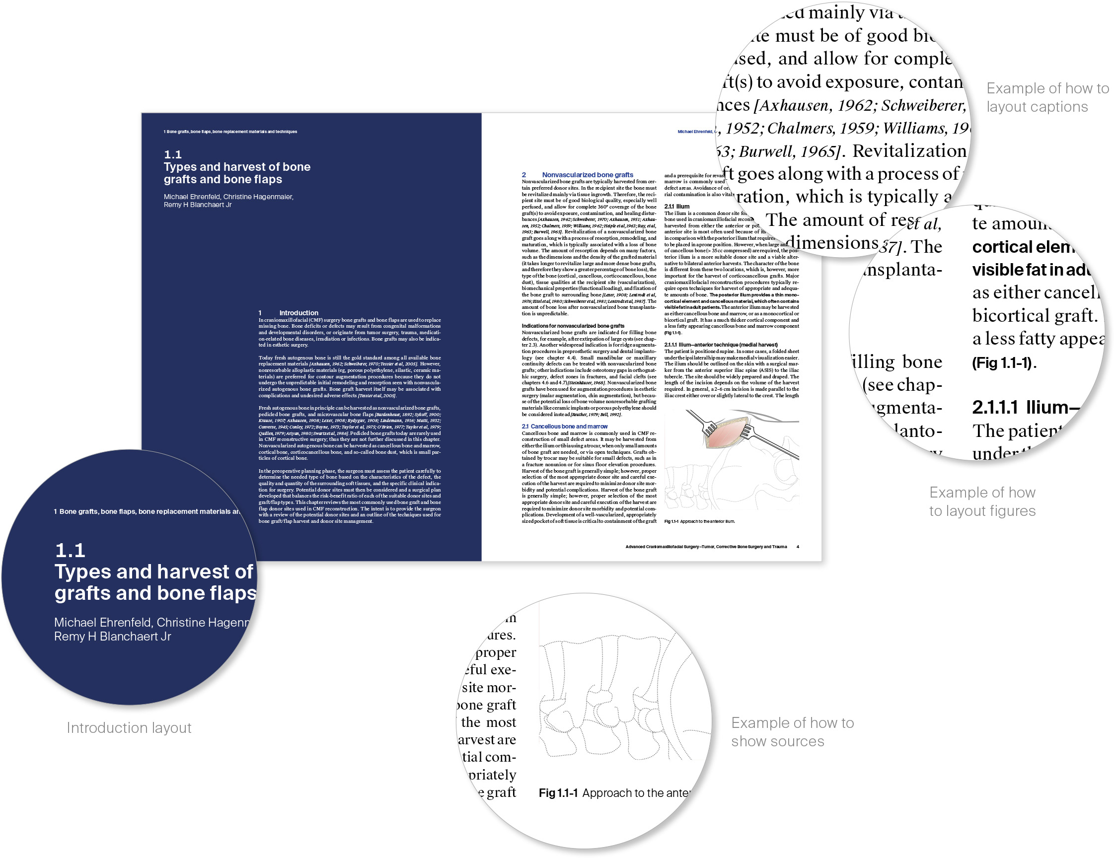
The layout of the content pages is clean and user-oriented so that different types of content can easily and intuitively be adapted.
As you can see here, special content such as references or figures are made recognizable by a differentiated use of typography.
The introduction to each chapter is also designed differently. Its concept is inviting, allowing for a faster, more intuitive capture of the content.
Book layout in detail
Books
Text pages, text hierarchy
One after another
Scientific texts need a clear structure so that readers can quickly navigate way between the individual chapters.
2 Lorem ipsum
2.1 Lorem ipsum dolor
2.1.1 Lorem ipsum dolor sit
2.1.1.1 Lorem ipsum dolor sit amet
Bodytext: Suisse Works regular, 8 pt
Accentuations: Suisse Int’l semibold, 8 pt
Subheadline: Suisse Int’l semibold, 8.75 pt
Lorem ipsum dolor sit amet, consectetuer adipiscing elit. Aenean commodo ligula eget dolor. Aenean massa. Cum sociis natoque penatibus et magnis dis parturient montes, nascetur ridiculus mus. Donec quam felis, ultricies nec, pellentesque eu, pretium quis, sem. Nulla consequat massa quis enim. Donec pede justo, fringilla vel, aliquet nec, vulputate eget, arcu.
Indications for nonvascularized bone grafts
In enim justo, rhoncus ut, imperdiet a, venenatis vitae, justo. Nullam dictum felis eu pede mollis pretium. Integer tincidunt. Cras dapibus. Vivamus elementum semper nisi. Aenean vulputate eleifend tellus.