Brochures
Cover principles
Consistency is key
The key to our corporate design is the correct combination of graphic elements to create a consistent yet flexible design system.
The basic structure is clear and easy. Position the logo on the top left, set semi-bold headlines, place pictures in the grid, and add other content carefully.
Accurate, deliberate design plays with the white space and creates clear and convincing communication. The layout principle is simple; apply it consistently.

– Brochure guidelines
Download assets
For ready-made templates including grid and other specifications, please contact:
communications@aofoundation.org
Brochures
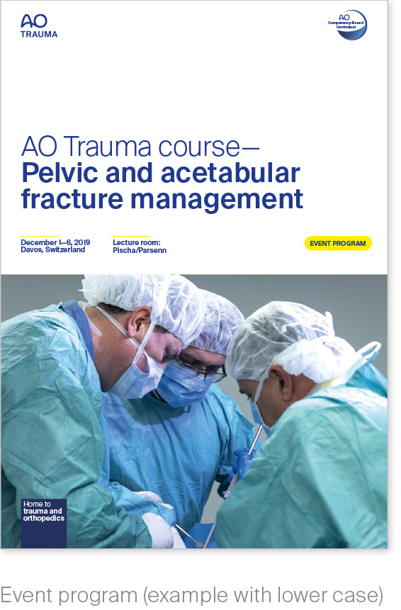
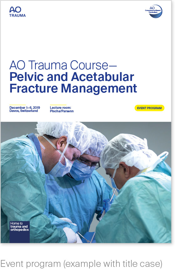
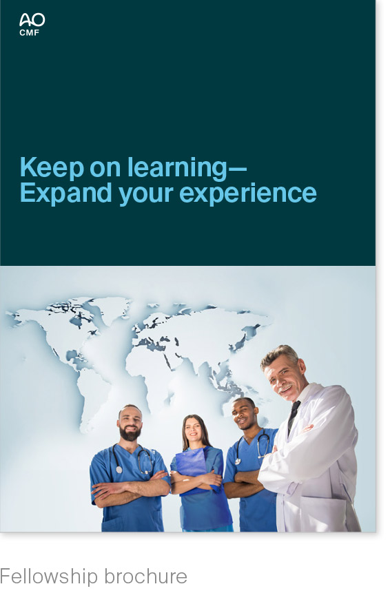
Cover, examples
One family
The way we approach AO
brochures must reduce
complexity by being:
– user-centered
– context-sensitive
– coherent, yet flexible.
We achieve this by using a clear and consistent, approach to type area, typography, stamps, and colors, that also involves dynamic principles.
A flexible grid, clearly defined typographic principles, and predefined color series make it possible to meet all these requirements.
The content owner decides whether to use sentence case or title case for brochure titles. Traditionally, title case is used to describe course titles, but not compulsory.
Consult the editorial style guide
for editorial guidance:
brand.aofoundation.org


Brochures
Cover, examples
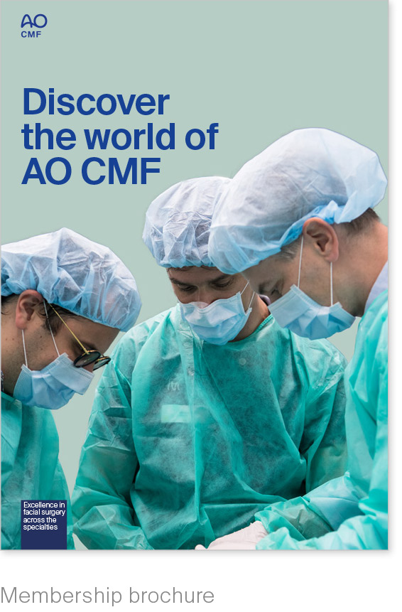
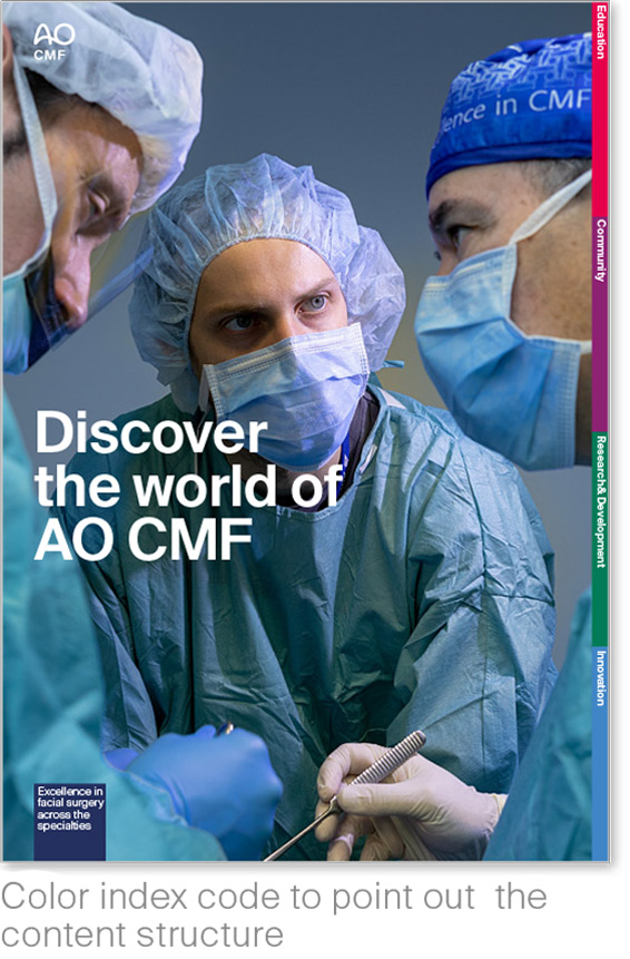
Membership brochure
We recommend a full-size cover image for this type of brochure.
The generous use of images gives membership brochures a more magazine-like appearance.
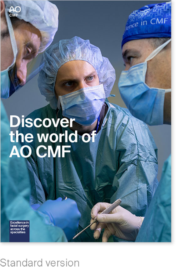
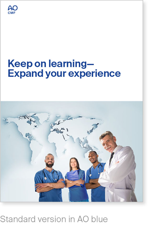
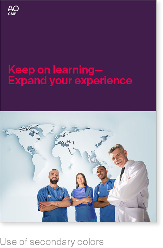
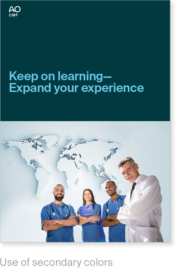
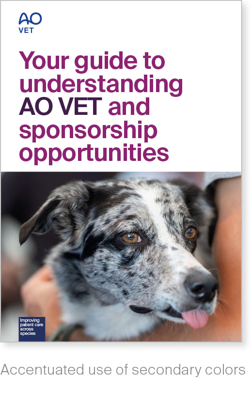
Promotional brochure
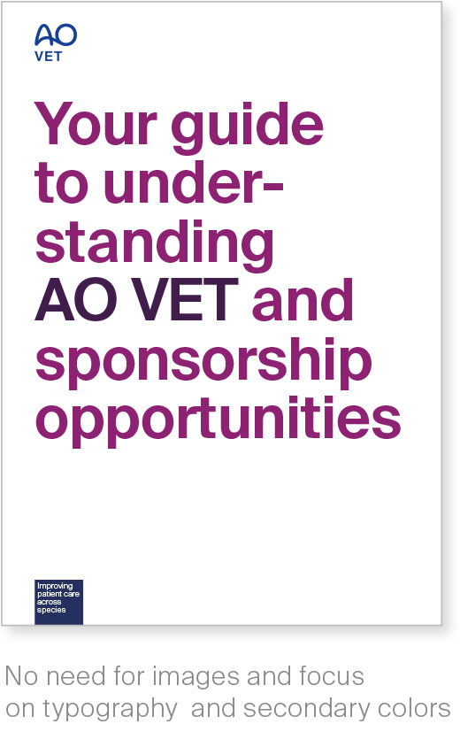
We recommend the incorporation of secondary colors as appropriate in promotional brochures.
The basic layout is neat, clear, and is brought to life by the use of fonts and targeted color accents.

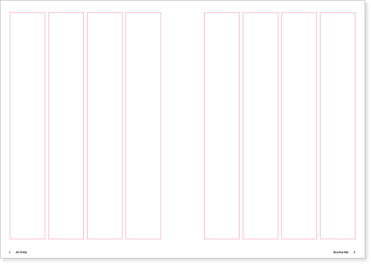
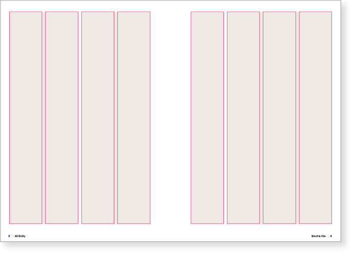
Brochures
Content pages, grid A4
Flexible
A simple, six-column grid serves as an invisible structure for all text page designs.
The grid can be applied in a variety of ways, responding to text type, overall length and pictures.
Successful layout exploits the tension between bold headlines and calmly presented body text.
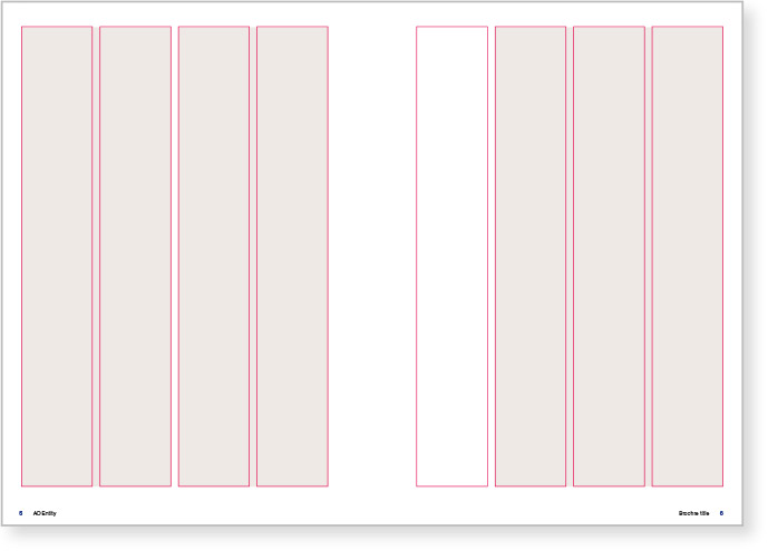
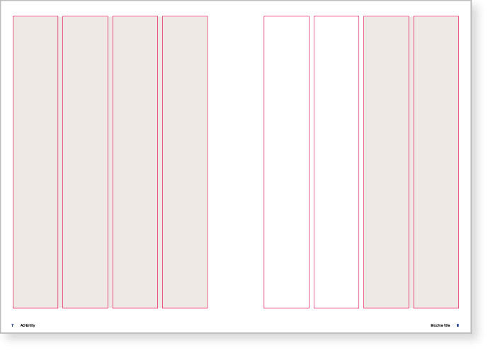
Brochures
Content pages, examples A4
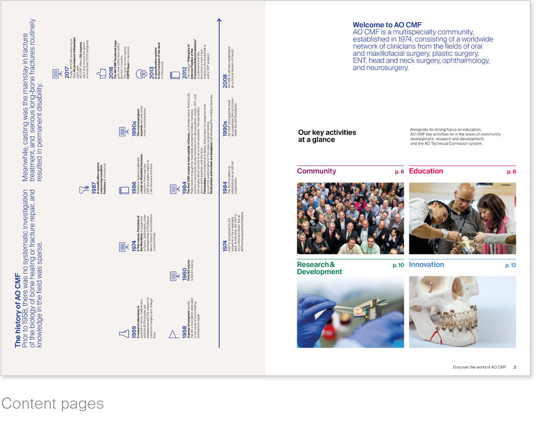
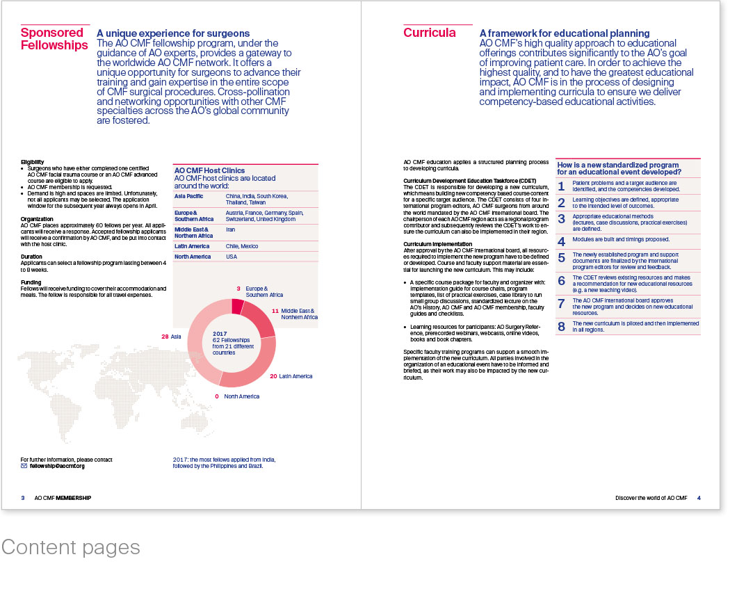
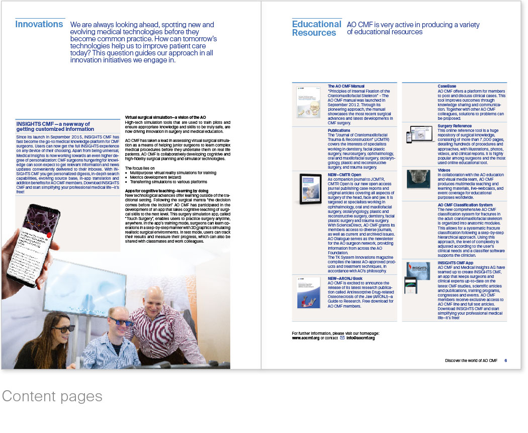
Simplify to improve readability
Comprehensive or complex brochures should be made as easy to understand as possible for the audience.
The basic layout should be reduced and focused on an intuitive presentation of the content.
The most important content should be clearly visible.
Contact
For detailed information please
contact Communications & Events:
communications@aofoundation.org
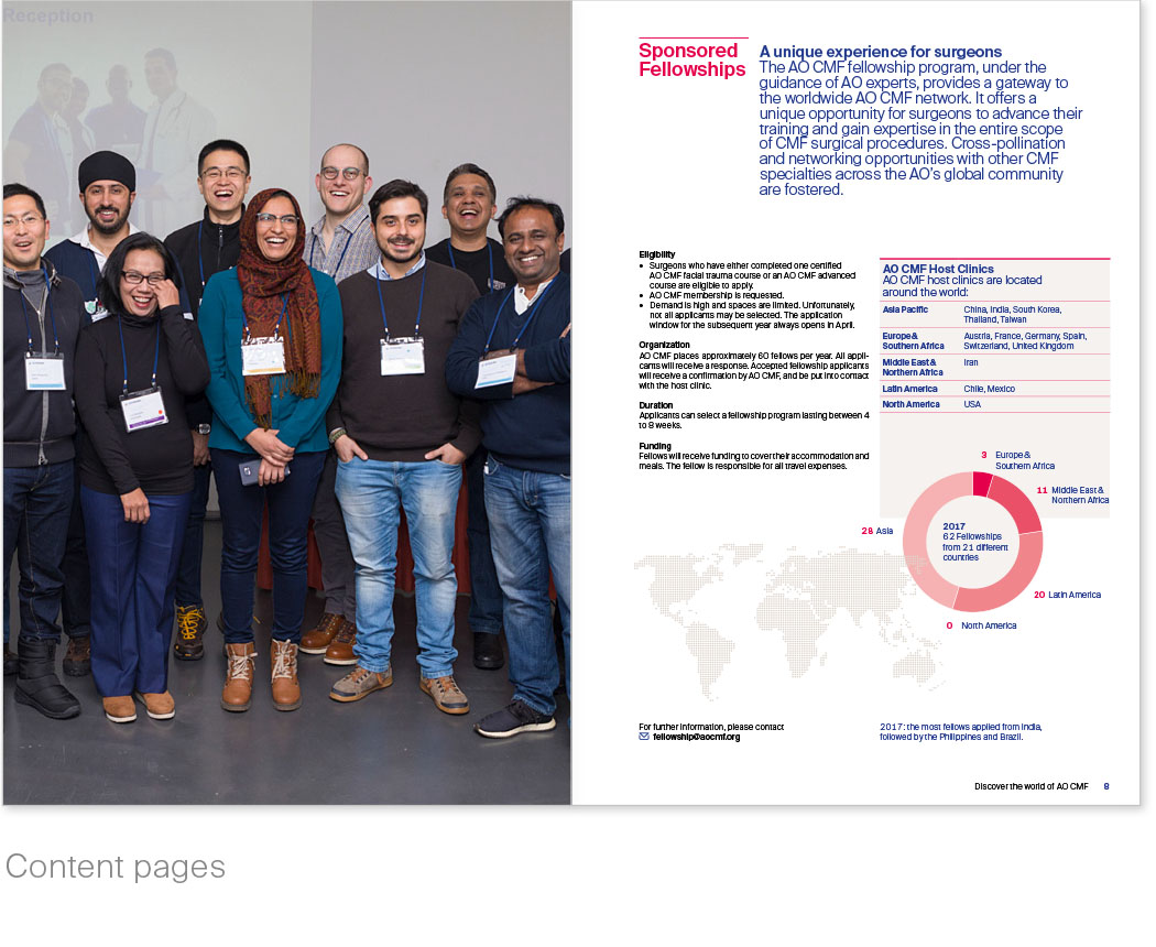
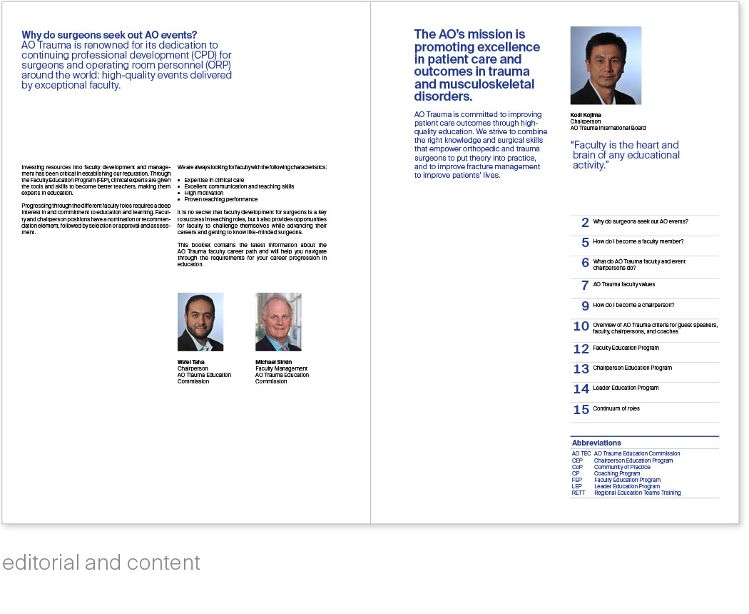
Example membership brochure with two addresses
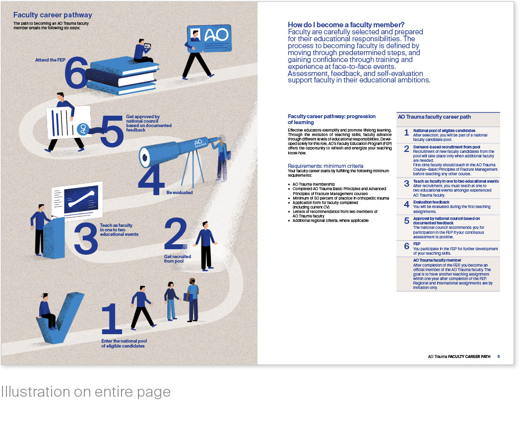
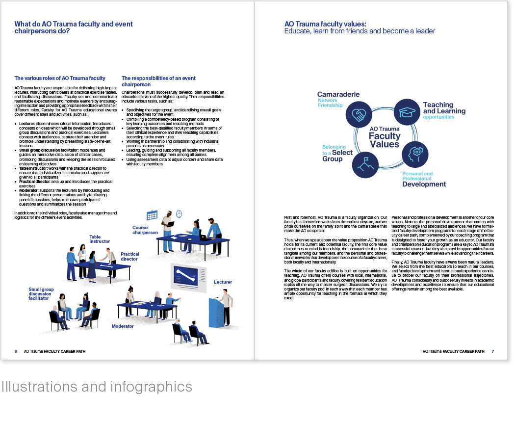
Example AO Trauma faculty brochure

Brochures
Cover, examples A5
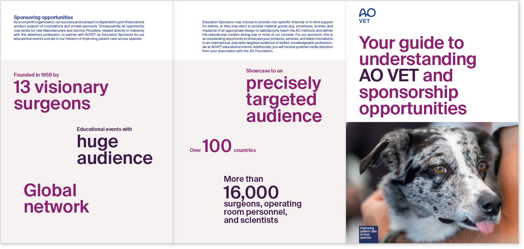
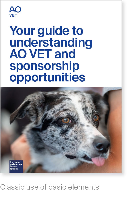
Sponsorship brochures
Small brochures, including those about sponsorship, should be compact.
You can play with basic design elements, but remember to select pictures carefully to make sure the brochure type is easy to recognize.
Brochures
Content pages, examples A5
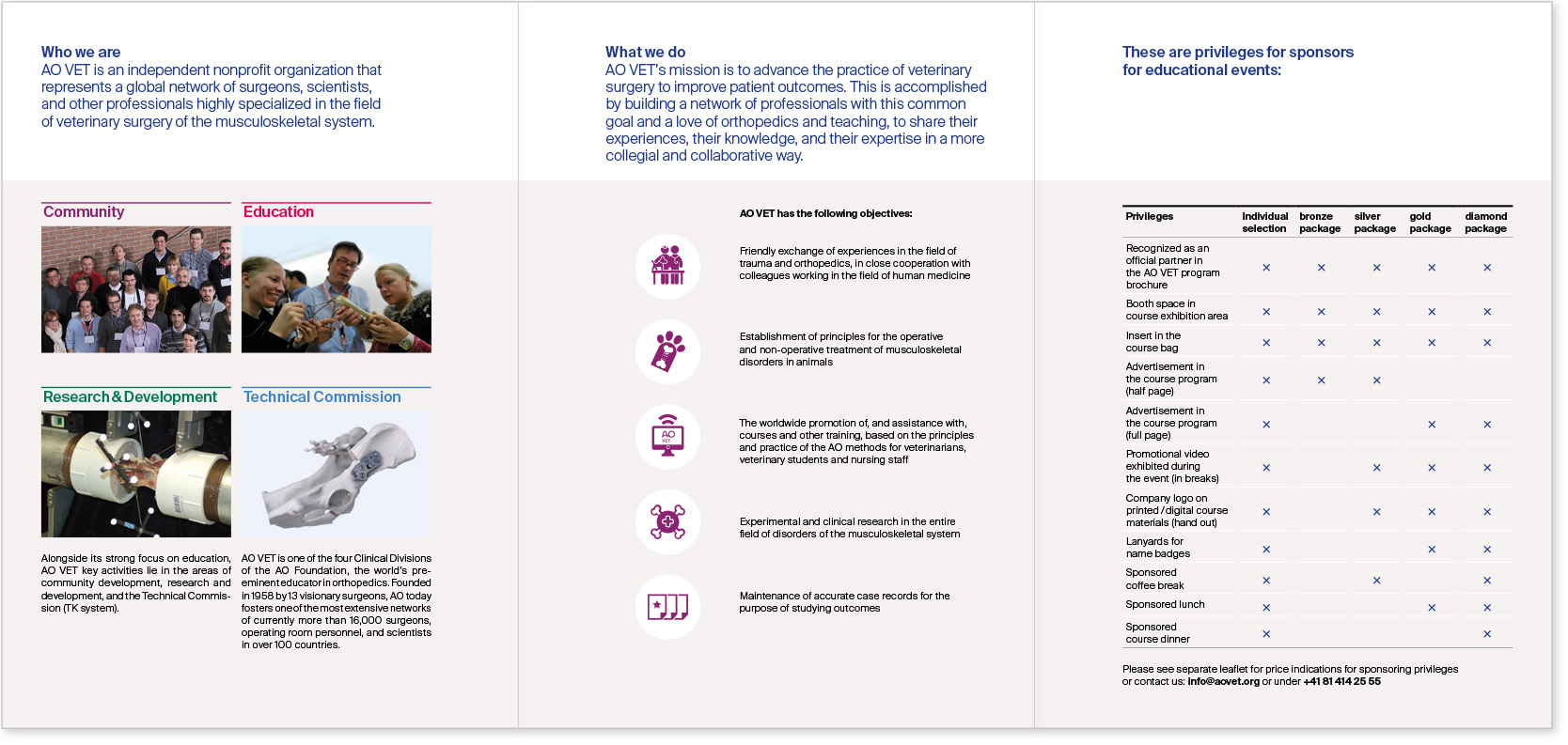
Set accents
Make sure small brochures contain
easy to understand content sections.
Use the following to guide the reader:
– clearly accentuated headlines
– structuring background colors
– prominently placed data.
– Brochure guidelines
Download assets
For ready-made templates including grid and other specifications, please contact:
communications@aofoundation.org