
Logo
Logo system
The master brand
The initialism AO forms the AO master brand and is the main application. Its soft, curved form represents the fact that people are at the heart of the AO, and the connected letters represent the community mindset.
Modular system
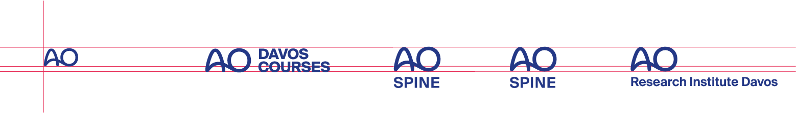
One system fits all: All sub-brands follow the same principle. The names of the power and flagship brands, clinical divisions and community pillars are placed on the left or below the master brand, depending on the category.
Minimum size
In general, every AO logo should be readable. The height of the master brand in combination with a word mark should be no less than 4 mm. The minimum height of the single master brand is 3 mm
Logo sizes
The sizes refer to the height of the AO master brand.
Master brand = AO logo
Modular system
Logo
Logo versions
Organized complexity
The brand architecture is structured as follows: The master brand is on the first level; all sub-brands are arranged with the appropriate extension or descriptor next to or below the master brand.
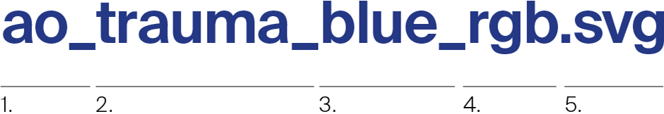
File naming: digital
ao_blue_rgb.png
ao_white_rgb.png
ao_black_rgb.png
ao_blue_rgb.svg
ao_white_rgb.svg
ao_black_rgb.svg
File naming: print
ao_blue_cmyk.eps
ao_blue_solid.eps
ao_black_cmyk.eps
ao_white_cmyk.eps
File naming: office
ao_blue_rgb.emf
ao_black_rgb.emf
Contact
For detailed information please
contact Communications & Events:
communications@aofoundation.org
1.
master brand
– ao_
Personalized
master brand
– myao_
2.
Foundation brand
– foundation_
Flagship brands
– davos_courses_
– surgery_reference_
Clinical specialties
– spine_
– trauma_
– cmf_
– vet_
– recon_
– sports_
Institutes (shortened)
– ei_ (Educational Institute)
– ari_ (Research Institute Davos)
– itc_ (Innovation Translation Center)
Endorsement labels
– curriculum_stamp_
– approved_stamp_
– tc_approved_stamp_
3.
– blue_
– black_
– white_
– blue_inversed_
4.
Digital applications
– rgb_
Pantone® full color
– solid_
Four-color process
printing
– cmyk_
5.
Digital media, lucent
– .png
Digital media, vectorised
– .svg
Print, vectorised
– .eps
Office, vectorised
– .emf
Logo
Sizes
Mind the size
The logo sizes vary depending on the medium.
Please note: For optical reasons, the AO master brand is always placed slightly larger than the brands with extension. The exact sizes per medium can be found in the list.
Contact
For detailed information please
contact Communications & Events:
communications@aofoundation.org
Logo
Logo use: Get it right
Be consistent
The AO brand architecture regulates the handling of all brands within the AO organization.
In order to maintain the consistency and clarity of this structure, it is essential that the different brand levels are strictly adhered to and not linked or modified.
Logo
Clear space
Space
The use of clear space is essential in preserving the logo‘s integrity.
It defines the minimum distance to the format edge and other design elements. The protection zone corresponds to one-half the height of the AO master brand (1).
In exceptional applications, you can use the minimum amount of clear space. This is one-third of the height of the AO master brand (2).
Standard clear space: one-half of the logo height
Minimal clear space: one-third of the logo height
Logo
Logo placement
Where to place
The logo is placed asymmetrically. The distance between the logo and the top edge is never the same as the distance to the edge.
Usually, the logo is placed in the upper left corner because of the horizontal and vertical extension of the AO master brand logo. Depending on the communication medium, the logos can also be placed on the top right or bottom right. Especially when the master brand logo appears alone.
Exceptions: If the communication medium to be designed has specific characteristics, then the logo is placed in the appropriate context, eg, in digital media (smartwatch = centered) or labeling locations (facade = centered).
Please note: For optical reasons, the AO master brand is always placed slightly larger than the brands with extension. The exact sizes per medium can be found in the AO brand guidelines (PDF) list on page 33.
Logo
Logo placement, examples
Getting it right
The AO logos are subtle and should not be the main focus of an asset. It needs to be part of the design, and not the main focus.
If possible, place the logo in the top left corner. If this placement poses a risk to readibility or the layout, a different solution is permitted.
These examples show how logos are placed schematically in different media formats. Find guidance on logo placement for Microsoft Office documents in → Chapter 3: Applications
Contact
For detailed information please
contact Communications & Events:
communications@aofoundation.org
Logo
Logo color
In living color
The AO logo comes in four colors: blue, white, black, and gray (in selected applications). Wherever possible, use the official AO blue tone.
Make sure there is sufficient contrast when placing the logo on background images.
Logos
Logos on backgrounds
Staging and backdrops
The first thing to do when placing the logo is to ensure readability—a must.
The blue logo should be used wherever possible. The negative version of the logo is used on blue or dark backgrounds if readability cannot be guaranteed.