AO supersign
Principles of cropping, placement, and color
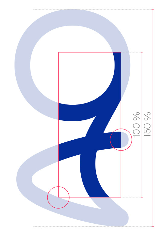
Clear, bold, unique
The supersign is always placed in the background of the layout, with a large increase.
Its organic, curved form contrasts with the clear, compact, Suisse Int‘l typeface.
This tension gives a sense of continuous movement and communicates the energy behind the brand.
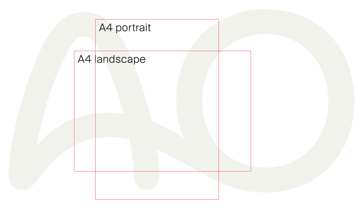
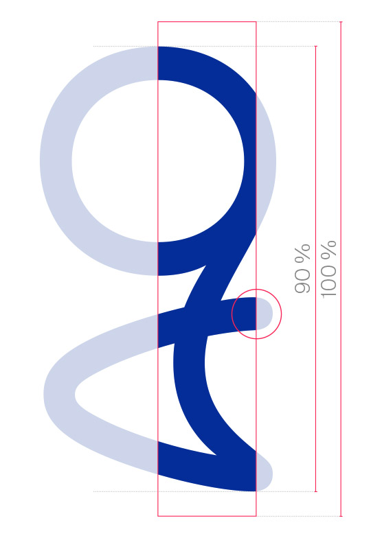
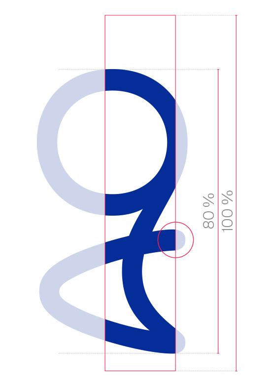
Cropping
When placing the supersign, it must be ensured that it is still shown as a whole piece.
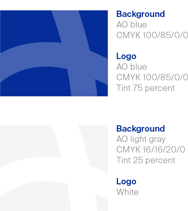
Color
The supersign is used as a kind of watermark in following color versions:
Blue: In the blue application, the supersign stands on the AO blue (100 percent) with 75 percent ink application. On the screen, the ink application must be at least 90 percent.
Light gray: On the AO light gray tone (25 percent) the logo is white.
Cropping principle in general
Color
Cropping principle on flags
AO supersign
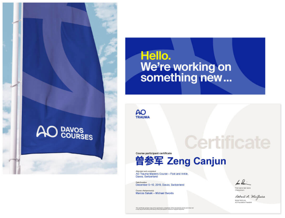
Examples
The large-format placement of the supersign in the background lends the brand presence an additional level of value and emphasizes the fluid, constantly moving core of a lively community.