
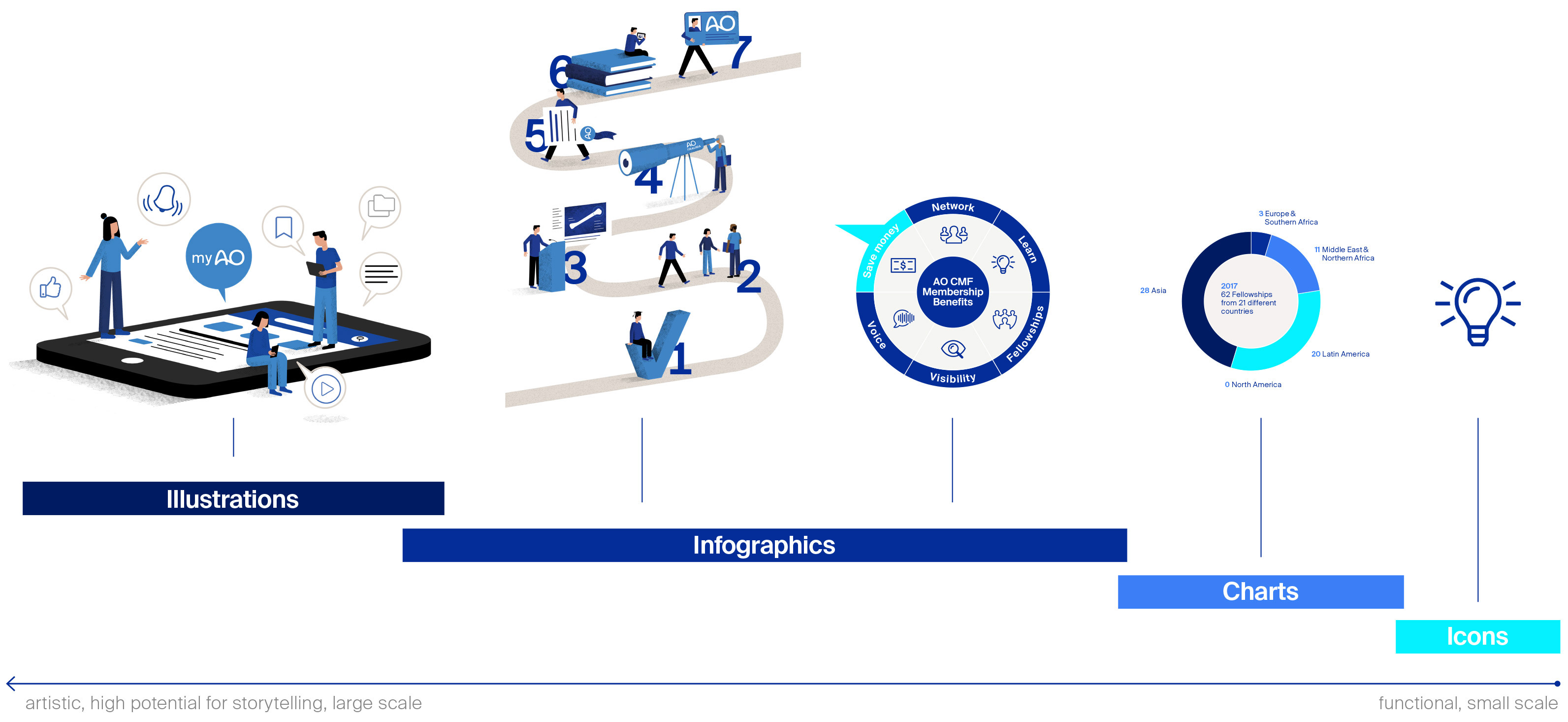
Illustrations and infographics
Main introduction
Illustrations are a powerful means of telling stories in their own unique, emotional way. Infographics can simplify complexities or make simple things visually exciting.
Independent disciplines, illustrations and infographics can be clearly differentiated from photography.
Following a human-centric design approach, illustrations and information graphics present sensitive or complex content in a vivid, comprehensible way. Illustrations are ideally used in situations where photography is not possible or suitable, such as abstract or metaphoric content.
Illustrations should never be used frequently or for solely decorative purposes.
Illustrations and infographics
An integrated concept
Illustrations (editorial)
- Stories
- Portraits
- Scientific issues
- Projects/initiatives
- Hierarchy
Infographics (editorial)
- Charts
- Diagrams
- Processes
- Situations
Infographics (functional)
- Diagrams
- Processes
- Maps
- Values
- Overview
- Lists
Charts
- Diagrams
- Data
- Scientific results
Icons
- Pictograms
- Symbols
- Signage
- UX/UI design
- Multilingual
audiences
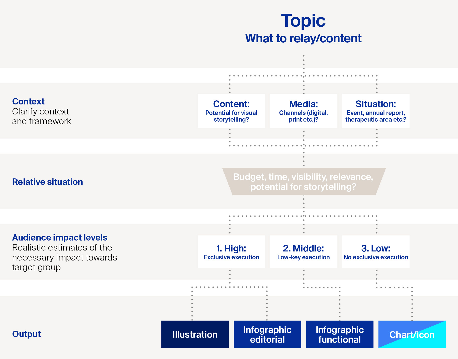
Decision tree
Need for an artwork visual
Function of AO’s illustrations and infographics (editorial):
- To visualize abstract or sensitive topics: Illustrations or infographics are ideal in situations where photography is either not possible or in some way not appropriate
- Illustrations and infographics present abstract or metaphoric content without being overly explicit
- Can be used for animations or explanatory movies
- Able to be used in all types of media, an illustration or infographic can be used in cover imagery in line with these guidelines so long as you are unable to find a photograph to communicate the main theme (as per the AO recommendations)
- Illustrations and infographics should never be used for beautification purposes, for example, to decorate a booth or event space
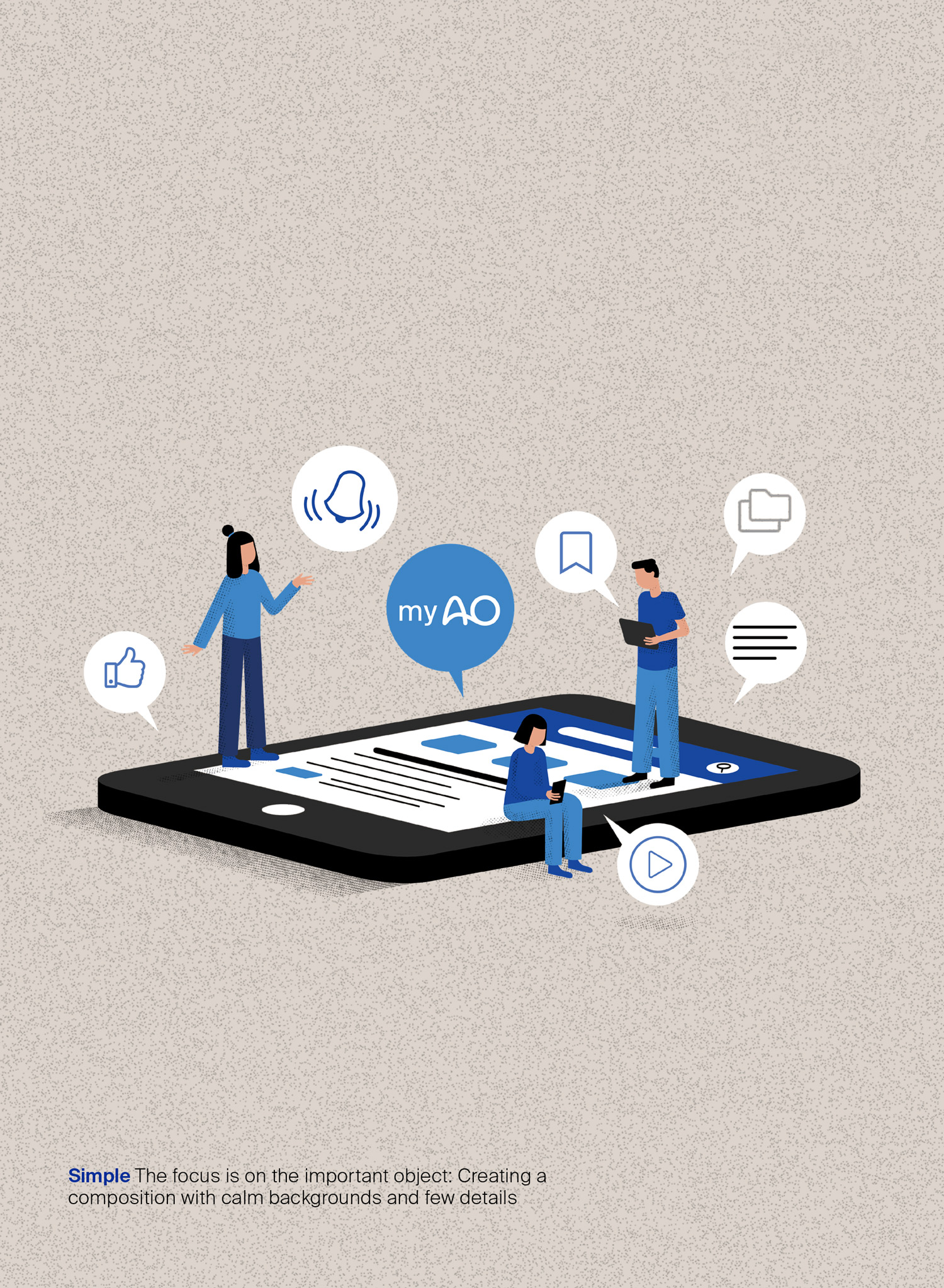
Illustrations
Visual expression
Be unique.
AO’s illustration style works both as a whole composition and as cutout, which enables a more flexible use across all media. The grainy structure and its handmade appearance makes the the illustration style appear warmer and builds a good contrast to the mainly technically driven content. The illustration style is highly recognizable because of its surreal proportions of people and surroundings. In addition, this specific illustration style is very suitable for animations.
Main visual attributes are:
- hand-drawn look
- grainy structure
- reduced color scheme (mainly primary colors)
- warm expression
- clean, tidy, simplified
- neutral backgrounds
- exposed and vivid
- creative and thought-provking
- surreal proportions
- playful
- strong contrasts
- direct and bold
- diverse
For detailed information about
illustrators please contact
Communications & Events:
communications@aofoundation.org
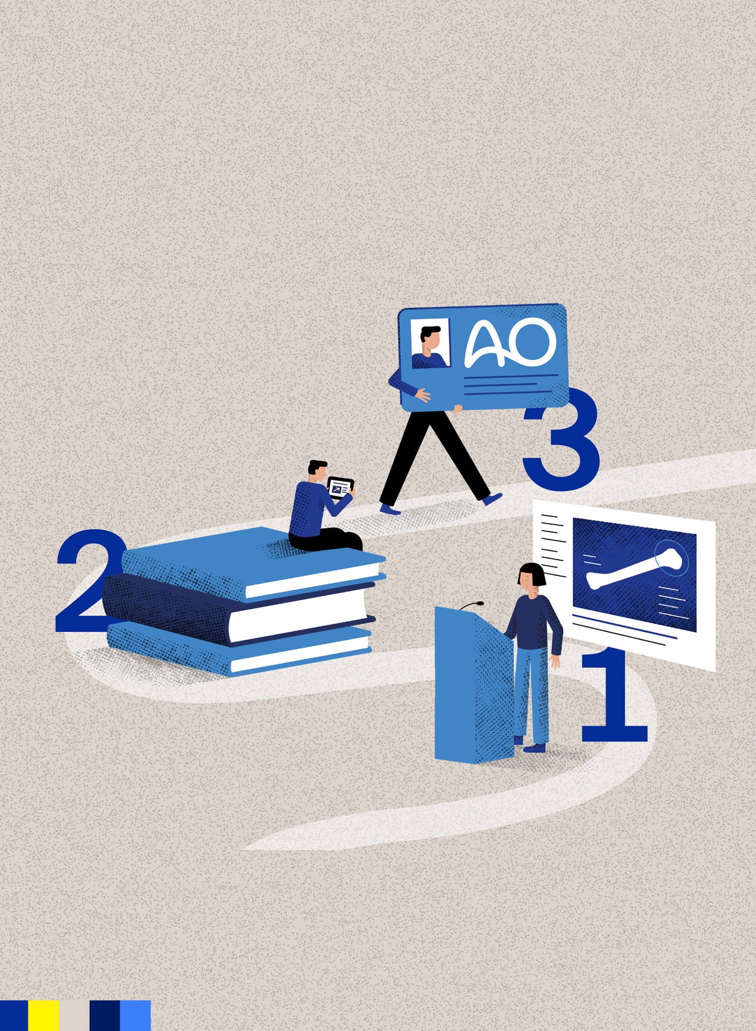
Infographics
Editorial style
Tell a story.
AO’s infographic style (editorial) uses single illustrative elements to present its often complex content in a human and accessible way. The grainy structure and its handmade style makes the overlook appear warmer and builds a good contrast to the mainly technically driven content. The infographic style is highly recognizable because of its surreal proportions of people and surroundings.
Main visual attributes are:
- hand-drawn look
- grainy structure
- reduced color scheme (mainly primary colors)
- warm expression
- clean, tidy, simplified
- neutral backgrounds
- exposed and vivid
- creative and thought-provoking
- surreal proportions
- playful
- strong contrasts
- direct and bold
- diverse
For detailed information about
illustrators please contact
Communications & Events:
communications@aofoundation.org
Infographics
Functional style
Simple and clear.
AO's functional infographics are designed to present complex content in the simplest form possible. They are used for charts or diagrams, as maps or to depict ethically difficult images such as organs. The style is simple and clear and tries to question and reinterpret old forms of representation in a creative way, always with the aim of making the content easily accessible.
Main visual attributes are:
- full AO color scheme
(primary colors, secondary colors) - clean, tidy, simplified
- neutral backgrounds
- creative and thought-provoking
- playful
- strong contrasts
- direct and bold
Note AO's infographics have round, dynamic shapes that compliment the movement (curvature) created by the logo. They can be displayed in both primary and secondary colors.

Infographics
Checklist
What to keep an eye on.
To ensure that the infographics meet AO criteria for a successful visual, follow these six steps.
Six essential rules for creating an AO infographic
1. Make one big point
Ideally, you should have a single, coherent message that the entire infographic serves to deliver. Think of it as a story told with data and visual metaphors, but the structure is still the same.
2. Use simple combinations of primary colors
If you add another color, make sure there’s a reason behind it, like if you find another piece of data that has to be separate from the others.
3. Space it out
Whitespace–or negative space, if yours isn’t white– is a fundamental element of good design. Contrary to what you might think, a cluttered infographic isn’t a good infographic. You need to pick which information best suits your premise that you want to display and use negative space to guide your reader through the visual until the conclusion is clear.
4. Use the AO fonts and glyphs
To make the sender clear and to support a uniform style, use the official AO font Suisse Int’l and Suisse Works only.
5. Come up with a solid, eye-catching design
Set up your storyline and how you want the infographic to flow from one topic to the next before you start laying it out.
6. Decide what is and what isn't important
Define which elements are the most important and how best to draw attention to that. This applies mainly to text and any figures or parts of a graph that you want to highlight. In other words, those elements which best exemplify which figures or facts you find the most interesting or relevant.