Colors
Color balance
AO blue
AO yellow
AO active blue
AO active blue is an additional color for accentuation and activation.
AO dark blue
AO dark blue is an additional color for backgrounds.
AO light gray
AO light gray is the leading color. It stands for clarity and progress. It is used for the logo, typography, and for backgrounds.

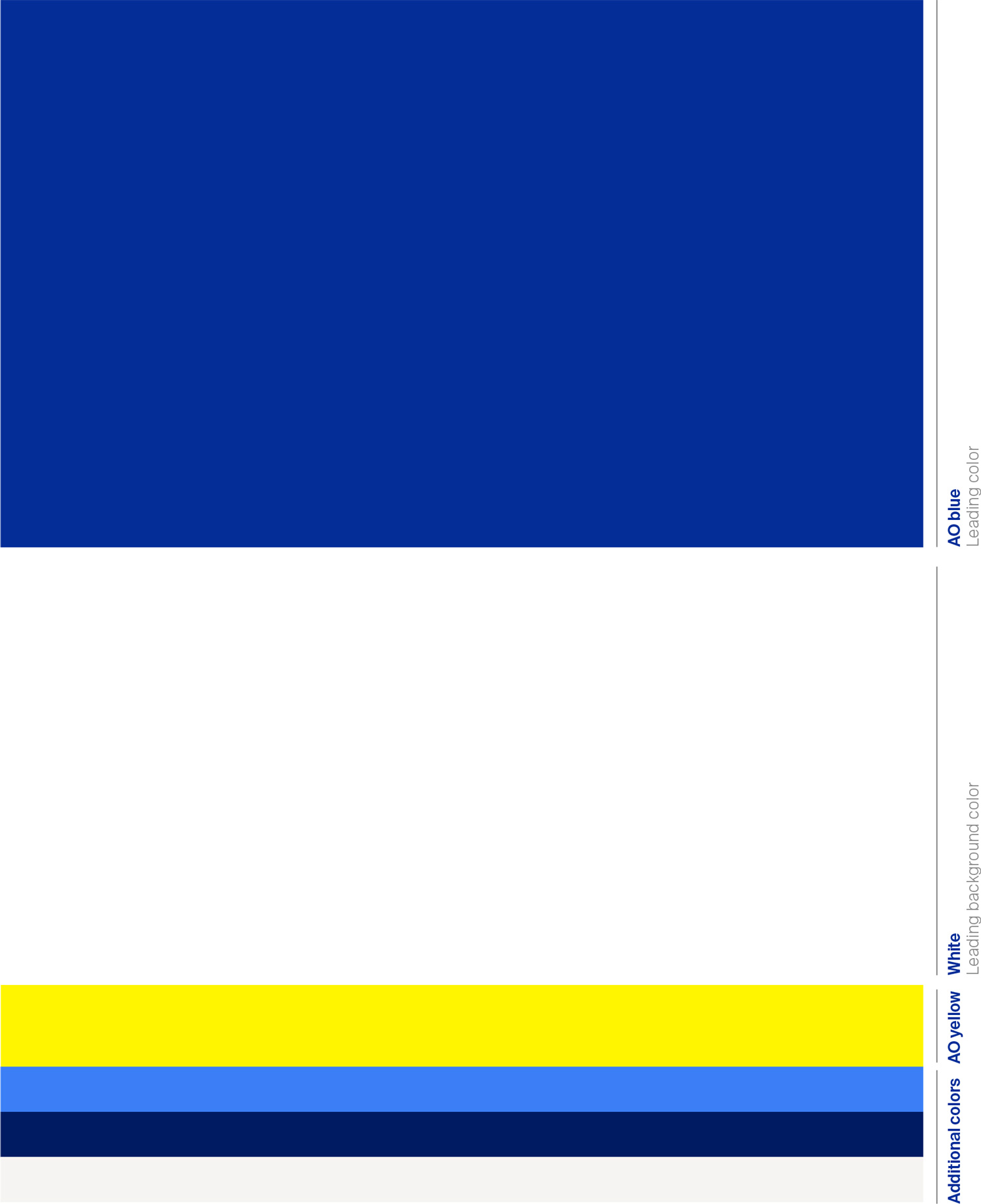
The overall color use per medium is based on the scheme shown here. The aim is a consistent color impression across all media. AO blue is weighted so that it is immediately perceived as the primary color, but does not appear too dominant in the overall impression due to sufficient white space.
Primary color AO blue
AO blue is the main application color and is used in the color area, in the logo and in the typography, as well as in graphic forms such as icons. Together with white, this combination accounts for 80 percent of the overall impression.
Accent color AO yellow
AO yellow is used as a color accent to highlight actions and important information. Its use should be kept to the minimum in any medium. Yellow is used sparingly, with caution. The maximum use of AO yellow is five percent.
Colors
Color balance
The overall color use per medium is based on the scheme shown here. The aim is a consistent color impression across all media. AO blue is weighted so that it is immediately perceived as the primary color, but does not appear too dominant in the overall impression due to sufficient white space.
Primary color AO blue
AO blue is the main application color and is used in the color area, in the logo and in the typography, as well as in graphic forms such as icons. Together with white, this is the most common colour combination
Accent color AO yellow
AO yellow is used as a color accent to highlight actions and important information. Its use should be kept to the minimum in any medium. Yellow is used sparingly, with caution. The maximum use of AO yellow is five percent.
All other colors can be used at a maximum of ten percent. Application examples can be found in → Chapter 3: Applications.
Colors
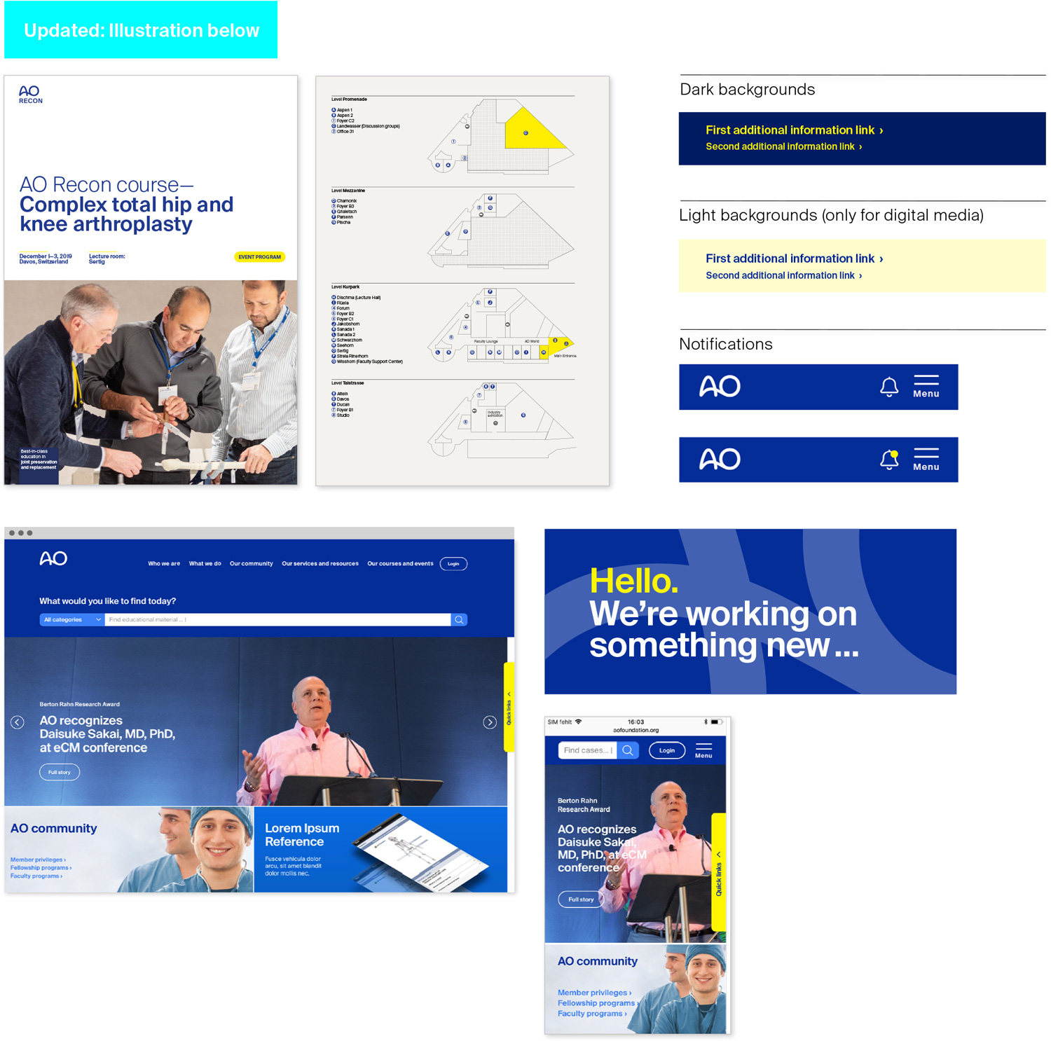
Accent color yellow
Yellow highlights
AO yellow should be used as a color accent for special emphasis. It can be used to mark space in a graphic or highlight key words. In its digital uses it is important as a trigger to action. It should be used sparingly, with caution and for good (clear) reasons.
Use
AO yellow should be used depending on context and functionality:
Activating: For calls to action, key messages, or specific emphasis, or for interactions with distinct added value (such as menu buttons in digital media or guiding elements in brochures).
Emotion: To trigger an emotional response at an event or through merchandising.
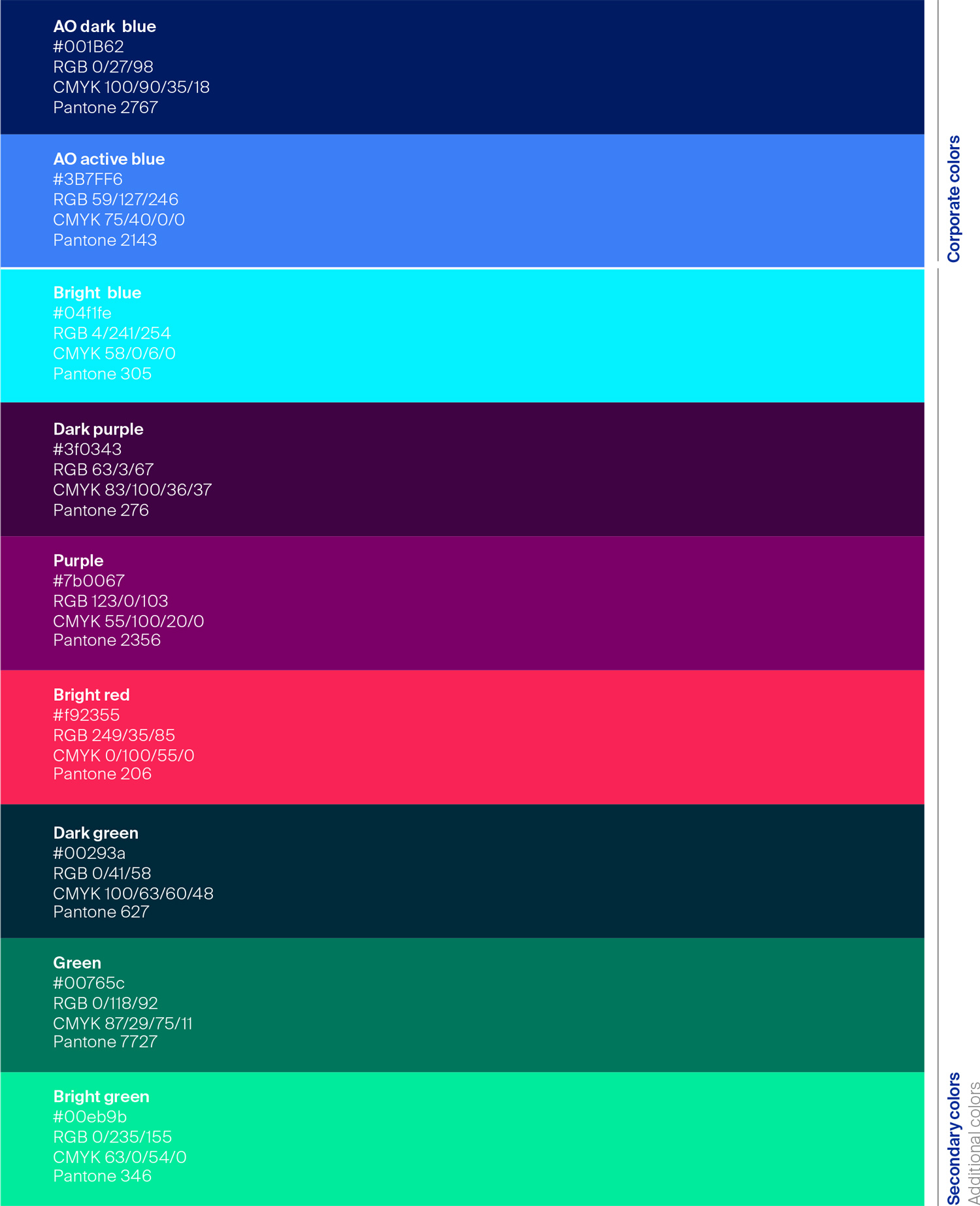
Colors
Secondary colors
Additional colors
The AO primary colors are complemented by secondary colors. The set contains an exciting triad of blue, red, and green tones. Each group of three contains a dark tone, a mid-range tone, and a bright tone. These tones can be combined or used monochromatically.

For the sake of completeness and to show the concept in its full spectrum, AO active blue and AO dark blue are also shown. These are, of course, primary colors of the AO brand.